Constructivism started in 1919 In Russia, it was heavily influenced by the ‘De Stijl’ (‘My Style’) design period of 1917. The constructivist approach was mainly aligned with Vladimir Lenin when he split with the Bolsheviks. The constructivist way of designing is based upon the rejection of self-expression which was the basis of the Bauhaus Movement during the same period. Constructivism is based on the industrial revolution in Russia and the faith was on Communism.
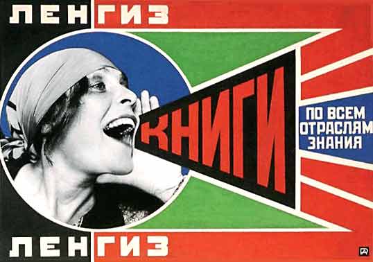
 This is the new Franz Ferdinand album cover for the album titled ‘You can have it so much better’. This is quite obviously a modern take on the constructivist art and design piece. There are several characteristics in which the constructivist period is characterised. This includes the invention of the sans serif typeface, as opposed to the serif that had been used before. The sans serif typeface was invented in 1917 and was used throughout the modernist period. The sans serif typeface was used primarily in the constructivist and Bauhaus Movement of 1919-33. The simple design and imagery is symbolic of the time period and the geometry of the design is typical of constructivism. The colours that have been used for this design are also the main colours that was used nearly 100 years ago. This piece was designed by Matthew Cooper and was a rework of one of the most famous constructivist pieces. The original piece is below. The image below is one of the most famous Rodchenko photomontages, which was made in 1924 for a Moscow Publisher. The Large red word simply says, ‘Books!’.
The second example that I have chosen to use as a modern example of constructive influence in modern day Graphic Design is also one of the most famous of the artists pieces.
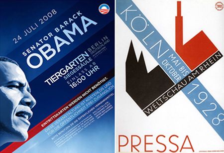
 This piece is designed and created by Shepard Fairey. It was created when Barack Obama wanted to associated himself with the modern day and with the younger generation, he went to Shepard Fairey and had this poster made up for his election campaign. The constructivist influence is evident with the bold, slab sans serif typeface that is used in this poster. Also, the poster campaign only uses 4 colours, the colour scheme during the constructivist design era was also very limited. The simple imagery again uses the characteristics of the constructive era. This could also be said to be influenced by the Bauhaus Movement in Germany during the same period as the constructivist. This is because of the sans serif typeface and the colour palette of only a few colours. The only thing lacking would be the geometric style shapes being used in the designs.


