Archive

Final Major Project

I have developed a style that I wish to continue throughout the App.

fmp_homefmp_splashfmp_login fmp_menu
fmp_camera fmp_folderfmp_uploadfmp_sketch fmp_sketch1fmp_pre-press fmp_basics fmp_align fmp_paperfmp_paper-lightfmp_inspirationfmp_projectfmp_port fmp_edit-port fmp_port-edit fmp_port-example fmp_port-tap fmp_profile
I have used the line from my logo all the way through the App, this allows the user to feel that the App has one consistent look rather than several different. I have used the Helvetica typeface, this is because this is stereotypically the designers choice. Many designers appreciate this typeface and I therefore thought it should be the main typeface for my App. I have used a Grey colour scheme for the main body of the App, this is because aesthetically, it makes the interface look very slick, this then fits in with the look of my logo. However, I have used some brighter accent colours to lift the overall design. I have used white icons with a subtle gradient as this is a usual look to digital icons in terms of Apple software etc, therefore this style of icon would be familiar with the my target audience. I did try these icons in a darker grey to contrast with the holding box but was told that this made the icons look inactive therefore the user would feel they cannot tap on it, this is obviously not what I wanted so changed them to white to stand out and look like more active buttons. The main functions are the icons down the left hand side, this is then sat next to the sub-categories or options within that category. This area is vital to the working of this App, it does however, take up a small proportion of the main content area. This is a compromise I am willing to take as this area genuinely is vital and the App cannot work effectively without it. The main content takes up over half of the screen, I think this is important as the main content area needs to be as large and as clear as possible.

After looking at my ‘Design Wise’ idea, I have thought that the logo designs that were produced were very bold and sharp as well as being very gothic. My last post showed a revelation in the form of a new name, ‘The Studio’. This came from the idea that designers spend most of their time in a design studio and they are very comfortable in that surrounding, it also suggests that there is everything a designer could need.

I have taken a slightly different approach to what I usually do, I normally draw some drafts of some symbols that would work well within my project. However, looking into existing Apps, the logos can be seen to be mainly typographic, this is seen on the iPad icons as well as the splash screen of the App itself.

Therefore, I have decided to go more typographic than I usually do, simply because the media requires it. So I drew up a few ideas that I could work with. I looked into several possibilities and developed them a little further and then chose one.

Screen Shot 2013-05-09 at 23.11.59

The logo idea is very basic and simple but is also very clean and professional, I think a professional and clean logo is vital for such an App as the target audience are purely designers, this means they are 100% aware of good design and most design logos as part of their occupation. A professional logo is also important as this is the first touch point of the App, the visual in the icon, as well as the name has to entice the user in and get them to tap on it while on the App Store. I think that the following ideas are able to do this and they would be able to appeal to the designers that would be using this App.

While thinking of visual ideas for the ‘Design Wise’ name, the obvious thing that sprung to mind when thinking ‘wise’, is an owl. This symbolises experience, knowledge and wisdom. This is what the name ‘Design Wise’ means too. I think this is a time where the obvious answer, seems to work really quite well.

However, I didn’t want to be completely predictable. I decided that I would try and use the most distinguishing features of an owl (its face and beak) and use the Initials DW as part of the shape. I started to work this up and here are some of the solutions that I came up with:

Screen Shot 2013-05-08 at 23.48.19


These are some of the ideas that I came up with, as you can see, they are very bold and very strong shapes. I think that I could do further development on these designs but am afraid of disliking the outcome even more so. These designs are a bit too gothic and bold to represent the utmost of modernity. I like the premise of the idea and think that the idea behind it works effectively. I have tried doing the same ideas but lightening the bold lines but it doesn’t have quite the same effect. I think that I will have hit a dead end and will now have to start from a different angle.

During the process of this logo development, I have come up with a new name, I think this one has a stronger meaning behind it and appeals to the designer in all of us. The name is… ‘The Studio’. This is a professional term for a design agency or design studio and therefore designers would be instantly familiar. This is also where hundreds/thousands of designers spend the majority of their day. It is a second home and is therefore quite a sentimental place. ‘The Studio’ also insinuates that this has everything a designer would want or need with them. I think this is a stronger name than anything so far and therefore will leave the ‘Design Wise’ at a stage of possible development if this idea doesn’t produce anything of quality. However, I will try and draw-up and develop some logos using the name ‘The Studio’.

I have been thinking about my App, it is based around the Graphic Design industry and therefore is targeting Graphic Designers.

I have been looking into potential names for my App and have come up with a couple of possibilities.

The first idea is ‘Blend’ – This idea came from the fact that the App will be ‘blending’ several functions and facilities together to make one single being. I like this idea and think that this would work quite nicely with my App. However, when thinking about the idea of ‘blend’, in terms of different visuals, there is not a lot of options. I haven’t thought about this in too much details as of yet as I am considering several different name choices.

The second idea is ‘Fusion’ – This was based upon the same idea as ‘blend’, in terms of taking several different entities and bringing them together. I think this idea has some potential with its visuals, but I am afraid that it could end up looking a bit too science-y, with Nuclear fusion and other such terms. For this reason, I think that I will steer clear of this idea.

A third idea is ‘Ahead of the Curve’ – This has a modern and zeitgeist feel to it as a name. This is deliberate, to make the user feel as if they are using something new and unusual. I like the sound of this and think it would suit my App. There is obviously the reference to a curve, a design component familiar with any designer. My only concern with this idea is the visual, to keep in league with the name, it would have to be very modern and cutting edge, but would also need to include a curve. This would limit the visuals somewhat but I will try and mock-up some visuals in hope that I can steer away from the obvious.

Another idea is ‘Design Wise’ – This is one of my strongest ideas. Design Wise refers to a person who is design savvy and is in the know with design. I think this would sum up my App perfectly. My App is very new and very unusual and is directly aimed toward designers. The phrase ‘Design Wise’ works on its own, but ‘Wise’ alone infers intelligence and experience. I think this is the idea that I will run with and see what develops.

Researching into the basics of design and then further research into Apps that offer this fiction, I found that the selection of Apps was very limited and that there are very few, if any, that showed a basic design section. This shows that designers do not have the facility to look back at the basics of design using an App, I think this should be a large part of the App as this has rarely been done before. I will look into 5 basic principles of overall design and will produce articles on what they are, how to use them effectively and the do’s and don’ts of that particular principle. I will also include images as examples to make the point clearer.

After deciding that a function of my App would be the use of having an online page that is able to transfer documents and images to and from the iPad, I have looked into some of the existing Apps that use this function as their primary function.

One of the main, most well known App available on the App Store is Dropbox.

Screen Shot 2013-05-08 at 20.48.06

Looking through the interface of the Dropbox App, it is very clear and very easy to use. The main navigation throughout the App is situated on the left hand side of the screen, where the right hand side is taken up by images and documents that can be transferred to and from the iPad. The interface is simple and impossible to get wrong.

The main content take up approximately 2/3 of the screen, I think this is a well designed factor as this proportion works most effectively. The left hand navigation through the App is big enough to use effectively and allows the user to tap on the function with ease. The main content is the only thing that changes through the App, with images and documents being in transferable.

However, I have discovered some flaws with this App, the App claims to allow images and documents to transfer to and from the iPad. Despite this, I have been unable to download any document or image from the webpage, onto the iPad. It is very easy to go the other way, but I have seen no function to which they could be downloaded to the camera roll etc. I feel that this could be a major part of the App that is potentially missing. Currently, the only way of transferring images is to view it on the Dropbox App and then screenshot the full-screen image, of which it then automatically registers in the Camera Roll. This method seriously depletes the quality and size of the image and is therefore not a ideal solution. In my own App, I will aim to have this function, I will have the ability to put files onto the server, and download them back onto the iPad. This will enable the user to fully control the placement of images on their devices. This way, they can also drop images onto the webpage and download it onto their iPad without jeopardising the quality of the image.

When looking into sketching / moodboarding / idea generation, I have looked into several of the best Apps that are existing and currently offer this function. I have done this to get a feel for the competition, but also to get a feel for the UI/UX that these Apps offer to the user.

As I mentioned in a previous post, I currently have the Paper by 53 App on my iPhone and so I looked at the interface and experience that the iPad App offered.

Screen Shot 2013-05-08 at 20.47.47

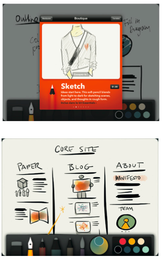
Looking at the interface etc, it is a very basic layout with the main canvas filling up most of the screen. This will allow the user to engage with the App and use it easier. It also gives the user space to work and doesn’t crowd the canvas. The bottom toolbar is very basic, with simple icons which are instantly recognisable to novice or expert users. This is an important factor in the usability of the App, if the icons are too complicated, it may take longer to generate the final idea or the user could easily become frustrated if they cannot find the correct tool they wish. There are simple colour schemes which can be scrolled vertically, allowing the user to choose the colours that the canvas uses. Once the idea is complete, the user can save the canvas locally within the App.

However, I feel that there are limitations to this App. Firstly, you cannot add text boxes, this can be frustrating as the user has to write using the pen or brush tool. This can become messy and can make some writing illegible to anyone reading. Secondly, the App doesn’t allow the importing of images. This function could increase the ability to moodboard effectively. The idea of a moodboard is to gather images of the style and feel that the user wants within their project, however, this cannot be done within this App. Another thing that could be improved is the colour scheme function, the colours are very clean and clear, but the user does not have the ability to download their own and use those within the App. I think this would improve the App as the user could then pick the colours they needed to use. Lastly, the saving function. I feel that the save function is crucial when looking into Apps such as these. The user does not want to lose the sketches/ideas as soon as they leave the App, however, on this App, the user can only save to the App itself, there is no function to upload or export via email or any such feature. I think this would be wholly beneficial to the user as they can draw something up, send to a client or colleague for approval or feedback, receive the feedback, alter the visuals/ideas and send it again. This can all be done without messing around on a Mac or can be done on a journey etc.

A quick word about the interface itself, the App is very user-friendly and lends itself to a novice that enjoys to sketch or is in the industry. However, I feel that the icons take up a large proportion of the canvas and could therefore be smaller, the icons themselves are very basic, which is good, but the functions are also very basic. My App would need to cater for the novice and the experienced designers and while some designers would only use the pen tool to get their ideas down, some designers like to layout their idea in a strategic manner, such as a spider diagram, in this App, the user would simply have to draw all of this themselves using the pen or brush tools. I think that my App would use icons that are 100% familiar to any designer and this way, the user could use the App for the first time, and know exactly what they were doing, the idea is to have all the usual functions that a designer uses on a daily basis. Functions such as a line tool, shape tool or text box.

Looking through some of the Apps that offer inspiration for designers, I looked into the Pinterest App. Now this App has grown massively over the last few years and has now become a regular visit for many designers. It simply allows the user to ‘pin’ images from the web and save it into categories that they can look through and see a library of images/projects that they like.

The Pinterest App is visually appealing to the user:

Screen Shot 2013-05-08 at 20.47.05

The Pinterest App is very generic in that it is not only designers that frequent it. There are all sorts of people pinning things about whatever they like, this can be anything from actors they like, to their last years holiday destination. The interface of this App is very user-friendly, allowing the user to jump straight into the App and after a few minutes, that are able to use it with ease. This is a huge selling point within the App as the premise is simple, the idea behind it is simple and the interface itself reflects this. The App show the ability to put ‘pins’ into categories which can be accessed as an album, where all the images/projects an be found. This is a really simple layout and the functions are incredibly easy to use. I aim to bring this simplicity into my App.

When researching into the functions that my App will offer, I looked into currently existing iPad Apps that offer the function of creating and editing a portfolio. I found a very, very small selection that offer this. Despite this, I did find an App that has a variation of this feature, I have done this to get a feel for the competition, but also to get a feel for the aesthetics and visuals that these Apps offer to the user.

Screen Shot 2013-05-09 at 23.31.32

This App is called Padport and allows the user to upload images from the camera roll and put them into a slideshow that can be scrolled through by the user. I like customisable options that the App offers, but the functions are very limited in that only images from the camera roll can be added. This is all well and good, but the App does not have a function to get images into the camera roll. One other thing I like from this App is that it has the ability to hold several portfolios and flow from one to another.

However, this App does have several limitations. Once the portfolio is created, it can only be viewed on that iPad, there is no function to export or send via email etc. Looking through the App, each image has a black border on it and is therefore not a fullscreen image. I think that this interferes with the image itself. There is the ability to lock the portfolio when it is published. This then makes it un-editable and complete. I think that this can be a downside as a designer will constantly be adding to a portfolio, therefore would be adding projects. Another limitation of the App is that there are several preset themes that run throughout the portfolio. Just a word about the UI itself, the building of the portfolio can be quite confusing, there is also no ability to re-order or add descriptions to the images. I think these are all very crucial parts of a portfolio.

I think that this App would be good if you had all the images you needed saved in your camera roll, if you wanted preset layouts and didn’t want to add any sort of description to your portfolio.

I have now decided that I will design an App with several functions that would cater to the needs of a Graphic Designer. Now I have these details, I have been able to write my own brief:

Screen Shot 2013-05-09 at 23.03.17